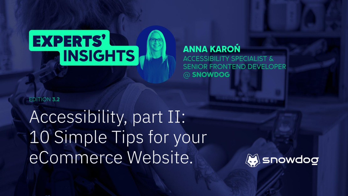
About our Guest: Anna Karoń

Digital Accessibility is the practice of making digital content, such as websites, apps and eCommerces usable by everyone despite their abilities and disabilities. It includes designing and then developing content in a perceivable, operable and understandable way.
The goal of accessibility is to ensure that everyone can access and use the content equally and independently. In the first article of our series, we provided a well documented introduction to Accessibility and gave strong rationale as to why it is profitable for online businesses.
Now that you understand the impact you can make and the growth opportunities it offers, you might want to get started but don't know how?
Truth is you can take small steps, and start with small tweaks to make your online shop, website or app more accessible. In this article I'll try to show you how to do it with 10 simple tips.
1. Website accessibility checker
Website Accessibility Checker is a tool usually a browser's extension that automatically scans a website and checks for compliance with accessibility standards and guidelines. Now, if you're new to the topic, you might ask what are the standards and who makes them? The most popular one is the Web Content Accessibility Guidelines (WCAG).
Getting back to the checkers topic... there are a few popular online tools like Wave, Axe Accessibility Dev Tools and AChecker. Those tools besides scanning your website can provide you with recommendations for improving your websites accessibility. They help you with identifying issues like missing alt text, low color contrast or improper heading structure on your website.
2. Clear and understandable language
This one might be surprising for some, but accessibility also applies to the language that you're using. It's a complex issue, but often we use too complicated language on our website, not only in the copy itself, but frequently in the commands too.
Use clear and concise language that can be easily read and understood. Use short sentences and avoid technical jargon if it's possible. How to know if your text is easy to read? Use the Gunning Fog Index! It's an index that rates the readability of a text (only in English). It estimates the years of formal education a person needs to understand the text on the first reading. A text accessible for a wide audience generally needs to be between 8 and 12.
3. Use headings and subheadings!
Doing such a simple thing as formatting your text is crucial. It helps you to organize your content and create a clear hierarchy of information. But that's not all! People who use screen readers and who have cognitive disabilities will be able to navigate your website more easily. Use H1 for titles, H2 for headings and format the subheadings as H3 and sometimes even H4.
4. Add alt text to images and non-interactive elements
Alt text (alternative text) is a description of an image or element that appears when the image/element cannot be displayed or is available for people who use screen readers. The alt text helps users with visual impairments to understand what's on the website - so make sure your alt text is descriptive and accurate. How to do it? Use this decision tree to make it easier.
It's crucial to use accessible name for all buttons and links without visible label (for example using `aria-label`). It helps people with disabilities, particularly those who use screen readers to understand the function of your buttons or links.
5. High-contrast colors
Now this one is a little more complicated because usually companies have their own logo and brand-book they have to follow. It may happen that the colors they're committed to are not very accessibility friendly, then you have to improvise. The goal is simple use colors with high contrast between the text and the background so it's easier to read. Users with visual impairments will be grateful if you don't put a logo on a vibrant and eye-catching background.
6. Captions and Transcripts for Video
Let's start with a little explanation. What's the difference between captions and transcripts? Captions are a text display of the audio content of a video or audio file. They are typically placed at the bottom of the screen and give you a transcription of the spoken dialogue and sounds. There are two types of captions: Open Captions (visible by default) and Closed Captions (CC, user-enabled).
Transcripts are a written version of the spoken content of an audio or video file but they are not synchronized with the file. They are often used as a separate document or webpage that can be read alongside or instead of the audio or video content. Transcripts are helpful not only for people with hearing impairments, but also for individuals who prefer to read rather than listen to audio or watch video content, or for those who need to find quickly and reference specific information within the content.
The goal of both is the same, though. To make your content more accessible!
7. Don't justify the text!
This is something that I learned recently, but justified text is not accessible. Well, at least it's less accessible than a left-aligned text. Why? Because it creates uneven spacing between words, and it makes following along with the text way more difficult than it has to be. But hey good news! You don't have to change your whole blog/website/app copy. Justified text can still be made more accessible by making sure that spacing between words, letter spacing and hyphenation settings are easier to read. Although I'd recommend using the left-aligned text if I were you.
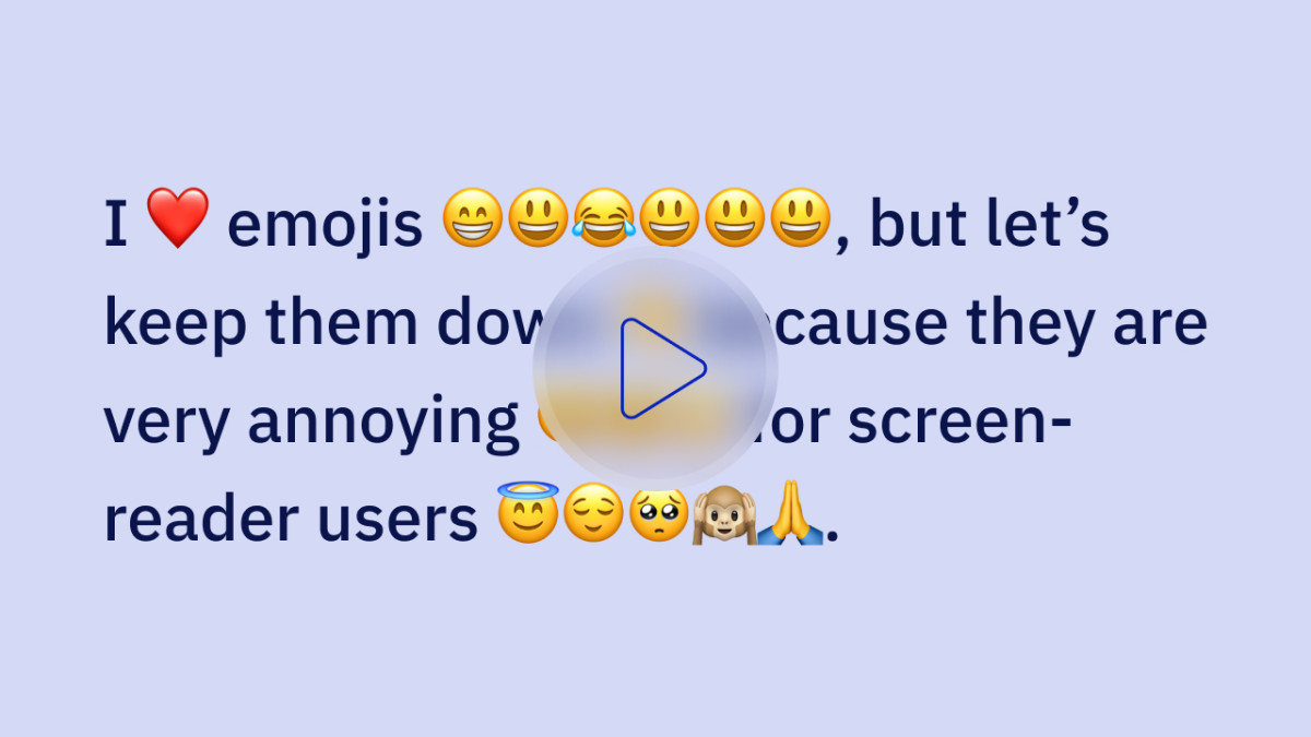
8. Be careful with Emojis!
This is something that is definitely not talked about enough. Using emojis is great and all. It helps to make content more cheerful, vibrant and tell the mood, but please be careful. The screen reader that goes through the text has to read them too! The video below is the best example of why you should be careful. Make sure that the alt text of an emoji says what you want to say + make sure that you're using complex emojis - emojis made out of two separate emojis right. e.g. a woman teacher emoji is a ZWJ sequence combining Woman, Zero Width Joiner and School.
9. Provide accessible forms and checkout process
Remember to use labels for fields and fieldsets to group form elements and provide instructions for completing the form. Use error messages that are clear and concise (don't rely on colors only!), and think about providing suggestions for correcting errors. Ensure that your checkout is accessible for users, including the ability to navigate the checkout process with a keyboard!
10. Use semantic HTML and clear documents structure
Semantically structured HTML helps to create a clear and understandable document hierarchy that can be easily navigated by assistive technologies such as screen readers. By using semantic markup, you can make it easier for people with disabilities to understand the content and structure of your website.
Summary
Of course these are only a few examples of the good practices, but it's a good start. By implementing these simple changes, you can make your eCommerce more accessible to a wider audience. What you have to understand is that the full-accessibility of a website is not attainable - I mean there's always something to be fixed, and our knowledge is constantly updated.
Stay in touch with us to read how you can improve your Hyvä's website's accessibility through the rest articles series from Snowdog.